
Monday, 12 December 2011
Thursday, 8 December 2011
Conventions of my music magazine.
-Masthead with big bold font so the name of the magazine stands out to the audience's eye.
-A slogan which will stay in the reader's head to remember which magazine it is.
-A caption underneath the main photo explaining who it is and what they are on the magazine cover for.
-Side stories to make the magazine seem believable for example, an interview with a famous musician.
-Banner headline with information on about the magazine ssuch as 'best magazine of 2011'
-Tease device to make the reader want to look into the magazine e.g. 'PLUS MARK D....'
-Layout is important, medium long shot of image in the centre of the cover, this is because you can then clearly see who the image.
-Logo to show the audience what magazine it is and when they see the logo they will know it is my magazine.
-Thumbnail images so it looks more professional and to show there is more stories inside.
Byeline-name of the writer so the readers see who wrote it and if they are well known will infuence them into buying it.
Thursday, 1 December 2011
Ideas
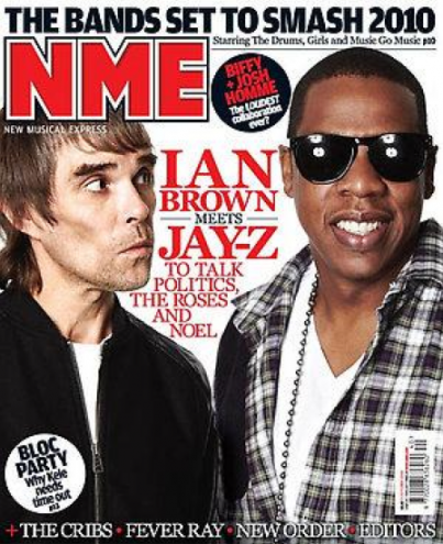
My magazine cover idea have been inspired by NME Magazine because they are informal, yet prefessional and many young people like the layout, including myself, hence why i have chosen a similar layout etc. I like the idea of having two celebrity musicians being on the front cover and Ian Brown (left) looking at Jay Z (right)
Target Audience
My target audience will cover a wide range of different kinds of different ages and stereotypes such as 'moshers' etc. and will be aimed at mainly teenagers because of 1) The price of the magazine is pretty cheap and affordable for young people to purchase with it only being £3 monthly. And 2) The layout of the magazine should jump out to the target audience because I have got my idea from NME magazine whose main target audience, in my opinion, is teenagers and young adults.
Subscribe to:
Comments (Atom)