
Monday, 12 December 2011
Thursday, 8 December 2011
Conventions of my music magazine.
-Masthead with big bold font so the name of the magazine stands out to the audience's eye.
-A slogan which will stay in the reader's head to remember which magazine it is.
-A caption underneath the main photo explaining who it is and what they are on the magazine cover for.
-Side stories to make the magazine seem believable for example, an interview with a famous musician.
-Banner headline with information on about the magazine ssuch as 'best magazine of 2011'
-Tease device to make the reader want to look into the magazine e.g. 'PLUS MARK D....'
-Layout is important, medium long shot of image in the centre of the cover, this is because you can then clearly see who the image.
-Logo to show the audience what magazine it is and when they see the logo they will know it is my magazine.
-Thumbnail images so it looks more professional and to show there is more stories inside.
Byeline-name of the writer so the readers see who wrote it and if they are well known will infuence them into buying it.
Thursday, 1 December 2011
Ideas
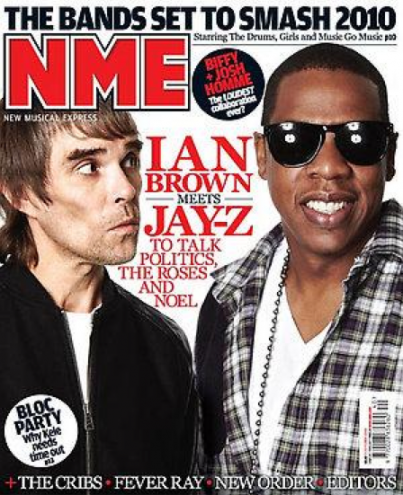
My magazine cover idea have been inspired by NME Magazine because they are informal, yet prefessional and many young people like the layout, including myself, hence why i have chosen a similar layout etc. I like the idea of having two celebrity musicians being on the front cover and Ian Brown (left) looking at Jay Z (right)
Target Audience
My target audience will cover a wide range of different kinds of different ages and stereotypes such as 'moshers' etc. and will be aimed at mainly teenagers because of 1) The price of the magazine is pretty cheap and affordable for young people to purchase with it only being £3 monthly. And 2) The layout of the magazine should jump out to the target audience because I have got my idea from NME magazine whose main target audience, in my opinion, is teenagers and young adults.
Thursday, 24 November 2011
About the Magazine
My music magazine will be priced very reasonably at £3 and it is monthly so the audience will prefer it to weekly because they wont have to buy it every week for £3 and will save them money in the long term. Another reason for it being cheap is that it is aimed at young adults who may not have a lot of money and may not be able to afford it buying it every week.
Thursday, 17 November 2011
Music genre
The music genre I am choosing to use for my magazine is rock to be associated with bands such as Oasis, Arctic Monkeys, The stone roses etc. I have chosen this genre because this is the music I enjoy listening to and thought it would be easier to do the magazine cover on the genre I find most enjoyable to listen to. My magazine cover idea came from the NME magazines which also associate with rock music. Another reason why I have chosen the genre of rock is because it has a wide range of different types rock which more people will like and hopefully buy the magazine because they like the genre of music and can tell what genre the magazine is from their first glance. I am going to do this by doing the cover in black and white with bright, bold colours for more emphasis.
Thursday, 10 November 2011
 In my music magazine cover I want it to have the same sort of style as this magazine because it has bright colours which stand out to the audience, a big bold masthead so the audience can easily identify what magazine it is. There are many different sub headings on the front cover to make the reader want to look inside by reading the information on the cover. The main image takes up the whole magazine cover more or less because there are two musicians; Alex Turner and Miles Kane back to back, both looking at the camera lens to make the reader think that they are making eye contacts with them. There is a lot of small pieces of information on the magazine cover to make the reader want to look inside and see what is going on with teasers such as 'Rolling Stones exclusive...Collaborating with Amy Winehouse?' Rhetorical questions on the cover of the magazine makes the audience think and want to know more about it and find out the answer in the magazine itself.
The colour scheme of this magazine is very consistent and precise with only 3 different main colours - red, white and black. The yellow colouring on the cover is for important information that most people will want to hear about. This makes it stand out because there is no other yellow on the cover and so it can be easily spotted.
Thursday, 3 November 2011
Market research
Lower down in my posts I have analysed a music magazine (same age group) and also a different college magazine to show the comparison between the two. The College magazine and the Music magazine are two completely different types of magazines but still look to sell to the same age group. They are still similar in the fact that they both have a main image, both have a big, bold masthead and have information on the front cover to show what is inside the magazine to make the audience want to read on in to the magazine.
LIIAR analysis of the breif
L-
Masthead - Magazine title, larger font so it is easily noticed on the front cover.
Bright colour scheme - consistent colour scheme with 2 or 3 main colours.
Main image - a medium close up (face and shoulders) students eyes must make contact with the audience for extra effect.
Price and Barcode
Main article - featured stories must be relevant to the front page.
Teasing contents along the bottom - makes the reader want to look inside.
Thumbnail images - other articles needed.
I-
Make different things up to make the magazine sound more professional i.e. Could say it has been published by an existing publisher which have something in common with mine.
I-
In my magazine the message I am trying to get across is that Wyke is a good college with good values and that everyone at the college get along and enjoy their subjects they have chosen. The target audience is for the students at the college so they can be informed at the end of each month about what is going on in the college.
A-
The target audience i have chosen is all students at Wyke who want to be informed about what is happening around the college. Also, this gives the magazine more chance of sales if it appeals to all students.
R-
I intend the students to look happy in the image to show that everyone at the college is happy, enjoying themselves and is a friendly environment. Wyke college will be shown positively in my magazine cover because it will be in bright, vibrant colours to stand out and not be dull.
Thursday, 20 October 2011
Magazine Brief
My magazine cover will be for Wyke College students only informing them on all the necassary information such as how the sports teams are doing like basketball, football, rugby, netball etc. Other peices of information will also be important such as interviewing the PE department on how the teams are doing, about the lessons of Wyke and how they are tought and if the students enjoy the teacher's style of teaching. Attendance is another key point in the magazine, in my opinion, because it shows that the college work together and shows that people want to learn and have funin the subjects hey have chosen.
For my magazine cover I am going to be consistent with my colour scheme so the magazine itself looks more professional and more people from the college will want to buy it. There will be a big bold masthead, with a dominant icon on the cover of the magazine which will stand out so the students know 1)what the actual magazine is called and 2)So people will see the icon and know it is Wyke College's magazine. It will be a reasonably priced magazine so more students can buy it with no money worries. I thought that if students have NUS cards then they can get half price on the magazine which will definately influence sales in the best possible way. My target audience will be for the people aged around 16-19 years because that is the age range of the students at Wyke.
My contents page will include different things to go into the magazine such as the rules of the college, i.e. no smoking around the site, it will include students being interviewed about the teachers and if they enjoy learning at the college.
Monday, 17 October 2011
Thursday, 6 October 2011

Monday, 3 October 2011
This is a simple magazine cover but it is easy to read, consistant in its colour scheme. The masthead is easy to remember seeing as it is a college magazine, also the masthead is in big, bold red writing to make it stand out more and go with the red t-shirt the girl in the centre is wearing. The text in this magazine cover is in Blue and black and so is the barcode, this shows consistency in the magazine which shows that it is professionally done. The main image is a medium long shot to show the readers of this magaine that the pupils at the college are mainly happy and friendly people. The girl in the centre of the cover has many different texts around her, this shows that she is the centre of attention.

Thursday, 29 September 2011
Magazine front cover conventions
Masthead - the magazine's title, usually on the left hand side.
Price - cost of magazine.
Date - weekly: saturday to friday; monthly: a month ahead.
Issue number - a tally of magazines.
Main feature - a phrase that may summrise the main point of the main feature. In large print, different styles,
bold colours in order to catch the attention of the reader.
Selling line - a statement which identifies what kind of genre the magazine is.
Cover line - gives you a bit more information about the magazine, like a seeling line but not as important.
Barcode - placed in a place on the cover of the magazine where it is not covering the image or any words so that the reader can notice that its in the same place so they know where everything is.
Main image - from the image you can usually identify what kind of genre the maagazine is if they recognise the person in the image.
Colour scheme - defines the magazines genre and also bright colours might be chosen to catch the reader's eye or to make certain information stand out.
Kicker - is a smaller font headline, usually under the main headline. Sometimes underlined under the text of the cover/selling line.
Subscribe to:
Comments (Atom)